This lab is about getting acquainted with screws and their properties under different lubrication conditions.
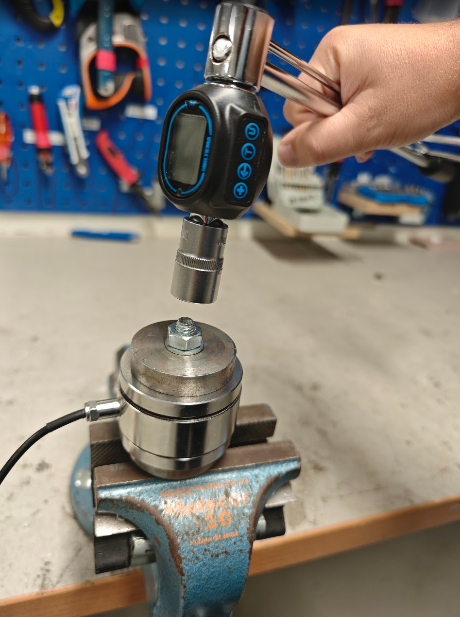
You will mount an M10 screw around a ring load cell and measure the tightening/loosening torque and axial force in the screw. Mount with washers on both sides. See figure Figure 9.1.1 for correct assembly.
You will perform measurements at three different lubrication conditions:
Dry screw
Lubricated screw with oil
Lubricated screw with grease
Change the screw and nut between experiments.
Workflow
Mount a screw without tightening it
Start the load cell (instructions below)
Start a measurement series
Either tighten the screw to a suitable torque (not exceeding the recommended torque), note the torque
Alternatively, tighten the screw to a suitable axial force (70% of the yield strength), note the torque.
Loosen the screw and note the torque required.
Repeat a number of times (3-5 times depending on the spread in the measured values)
Save the measurement series and plot with python
Questions
How does the tightening torque differ between the different lubrication conditions?
How does the loosening torque differ between the different lubrication conditions?
How does the tightening torque differ from the loosening torque?
How does the spread in the measured values differ between the different lubrication conditions?
How much force can the screw take before it breaks? (Use table values for the material and compare with your measured values)
How much force does a vise generate?
Lubricate the vise screw and compare with previous measurements. What happens and why?
Can you think of more questions? Discuss with your supervisor. Test if time permits!
Getting started with the Load Cell
Connect the USB cable from the load cell to the computer.
Start CoolTerm.exe, available for download here: CoolTerm
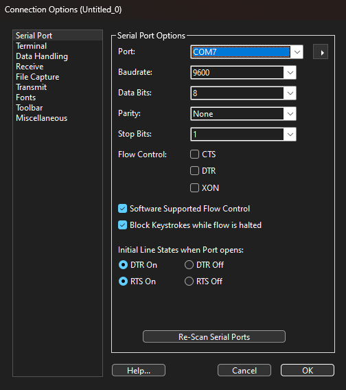
Select “Options”
CoolTerm connection options
Select the USB port to which the load cell is connected (in my case “COM7”). Unplug and plug the USB cable back in to see which one disappears and comes back.
Select “9600” as Baudrate.
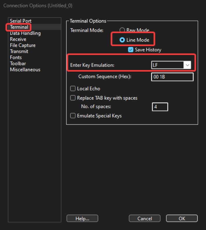
CoolTerm terminal options
In the Terminal tab, select Line Mode and set Key Emulation to LF.
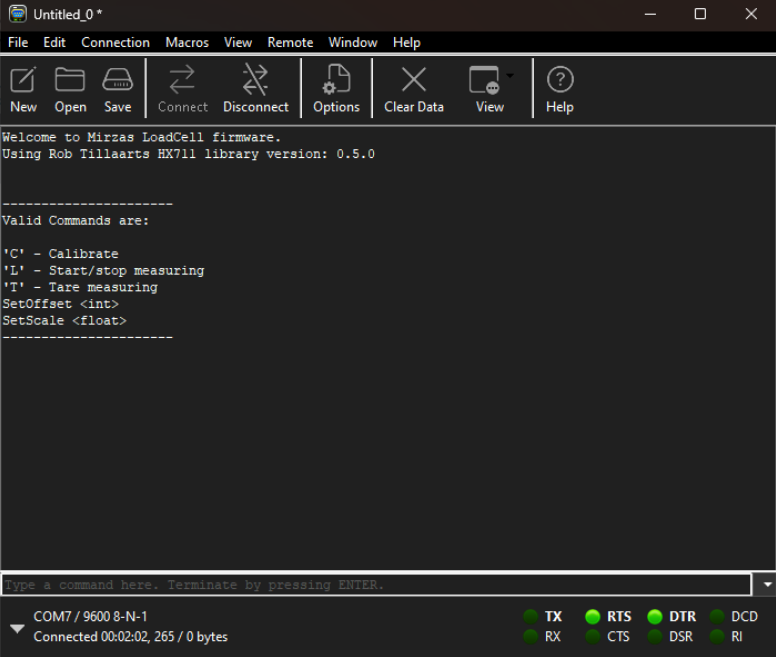
CoolTerm load cell welcome text
Connect the load cell by clicking on Connect.
Now the load cell starts, give it a few seconds and you should see the welcome text from the load cell. Otherwise, you can press Reset on the load cell. Then you should see the text in the image above.
Type L and press enter to start/stop the measurement.
The load cell sends values in kg
Click on the view icon to select plot, then the values are displayed in a graph. It is possible to reset the graph by clicking on Clear.
If the load cell is not close enough to 0 for your taste, you can send T to tare it.
Save data
When the load cell is running, press CTRL+R, save with a suitable name
When you are satisfied with the experiment, press CTRL+SHIFT+R to save
Open the txt file in excel or in python for visualization.
Assembly instructions
This lab is about getting acquainted with screws and their properties under different lubrication conditions.
You will mount an M10 screw around a ring load cell and measure the tightening/loosening torque and axial force in the screw. Mount with washers on both sides. See figure Figure 9.1.1 for correct assembly.
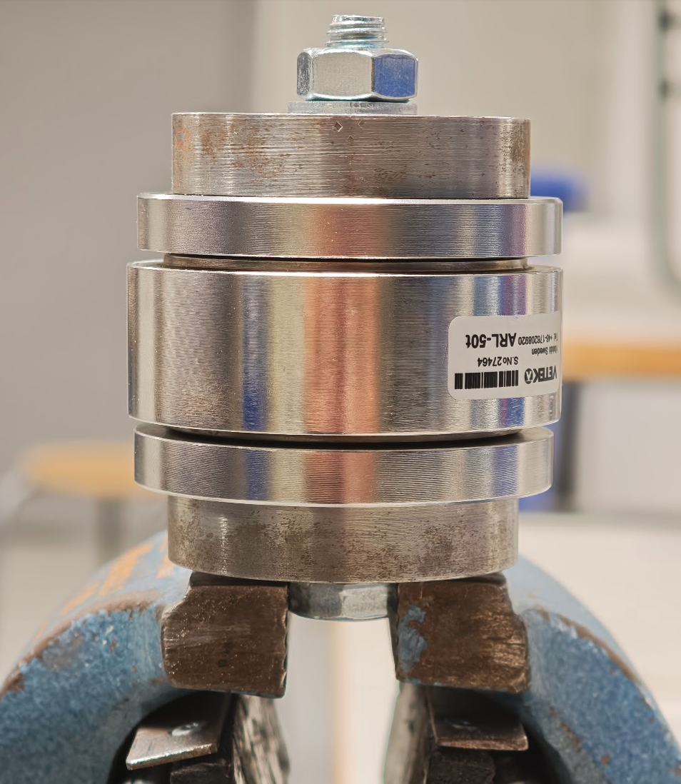
Figure 9.1.1: Correct assembly of M10 screw in vise. The head of the screw should be mounted in the upper part of the vise.
Figure 9.1.2: Setup of measuring equipment. The head of the screw is clamped in the vise. The nut should be tightened with a torque sensor.
Plotting serial data with python
Let ’s say you have saved your data from CoolTerm in a file called CoolTerm Capture 2024-11-19 23-14-21.txt. You can use the following Python code to read and plot the data:
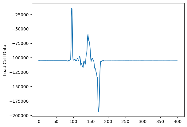
fileName ="assets/CoolTerm Capture 2024-11-19 23-14-21.txt"withopen(fileName, "r") asfile: data = [float(num) for line infilefor num in line.split()] import matplotlib.pyplot as pltplt.plot(data)plt.ylabel('Load Cell Data')plt.show()
Or use plotly for a more interactive visualization:
import pandas as pd# Note: Takes a little time to loadexcelData = pd.read_excel('assets/loadcell_data.xlsx', usecols="D:E",header=None, names=["D", "E"])excelData
D
E
0
0.000
0.000
1
0.013
0.039
2
0.090
0.270
3
0.041
0.123
4
0.010
0.030
...
...
...
395
-0.091
-0.273
396
-0.082
-0.246
397
-0.122
-0.366
398
-0.131
-0.393
399
-0.100
-0.300
400 rows × 2 columns
Above, we have the data from the file loadcell_data.xlsx.
We read in the columns D to E with usecols="D:E".
We name the columns with names=["D", "E"]
Below, we plot the columns D and E against each other.
import pandas as pdimport plotly.express as pxfig = px.line(excelData, y=["D", "E"], title="Excel columns", template="plotly_dark")fig.update_xaxes(range=[90, 180]) # Here we set the x-data to start at 90 and end at 180fig.show()
Why not create a shaded area between the two curves to visualize the difference?
import pandas as pd import plotly.express as pximport plotly.graph_objects as gofig = px.line(excelData, y=["D", "E"], title="Excel columns", template="plotly_dark")fig.update_xaxes(range=[90, 180])# Add shaded area between the linesfig.add_traces([ go.Scatter( x=excelData.index, y=excelData["D"], mode='lines', line=dict(width=0), showlegend=False ), go.Scatter( x=excelData.index, y=excelData["E"], mode='lines', line=dict(width=0), fill='tonexty', fillcolor='rgba(0,100,80,0.2)', showlegend=False )])# Show the plotfig.show()
It is interesting to see the average difference between the two curves, which we can get directly with pandas using our excelData dataframe.
# Calculate the averageexcelData['Average'] = excelData[['D', 'E']].mean(axis=1)# Create the line plotfig = px.line(excelData, y=["D", "E"], title="Excel columns", template="plotly_dark")fig.update_xaxes(range=[90, 180])# Add shaded area between the linesfig.add_traces([ go.Scatter( x=excelData.index, y=excelData["D"], mode='lines', line=dict(width=0), showlegend=False ), go.Scatter( x=excelData.index, y=excelData["E"], mode='lines', line=dict(width=0), fill='tonexty', fillcolor='rgba(0,100,80,0.2)', showlegend=False )])# Add the average linefig.add_trace( go.Scatter( x=excelData.index, y=excelData['Average'], mode='lines', name='Average', line=dict(color='yellow', width=2, dash='dash') ))# Show the plotfig.show()